Followers

Featured Slider

Powered by Blogger.

Exploring - Barcelona Graffiti Park

Wow wow wow....
This place made me feel so inspired! From the colours to the bold lines, to the fun cartoon illustrations. While I was exploring Barcelona, I came across this park filled with graffiti.. they even had people doing some at the time which was amazing to just sit and watch. People grabbing all of the amazing cans of colour and truly creating masterpieces on a brick wall. Watching them truly has inspired me to let go of digital design and get my paint brushing back out!

Just looking around at the bright vivid colours capture me straight away. In the past I've always been afraid to use bright colours and come out of my shell. But after visiting this wonderful hidden gem in Barca, Ive decided I'm going to use a brighter colour palette in my work.

The more and more I look back these images I spot new parts of the designs to look at!

This one made me giggle abit too much!


Looking more in depth at these images they really are a good source for mark making patterns/text/colour
inspirations


Trend report SS19 / Future Female

Future female en-captures the girl power movement perfectly. With a brand new futuristic planet which is bursting with light clean optimism run by a female nation. Holographic surfaces meet with bold slogans to create prints full of female empowerment. Glow in the dark textures and overlayed sequins add a dramatic effect to this trend. The colour palette for this trend is fairly neutral due to the light metallic finishes being used. I would say it would be best to stick to soft pastel tones which will over set against the bold quotes and surfaces to keep this trend feminine.


I would say the main finishes to be used for this trend would be high gloss finishes, solid colour application and a coloured marble effect. Please find below a few prints I have done based around this trend....


What kind of things would you create based around this trend?

Fast food or fast fashion?


Since going to Maison et object all I have seen everywhere is fast food turned into all sorts of objects, prints and patterns. The one I've fallen in love with the most is Paperchase's take on it, they have created a range of dog characters which have been transformed into there own unique fast food. ( My personal favourite is the Frenchie fries!!) You could follow this quick fashion trend in so many ways, from stationary to pin badges. This is definitely a fashion trend I don't mind staying around for a while. Personally, I think I would take a more interior edge to it, and maybe have a donut mug like the one Asda currently has in there latest dinnerware collection? What about you?

Please find below a few images of my absolute fav items of this trend!


Doesn't this pug just look good enough to eat!

One of my all time favourite stores Skinny-dip always appear to have some food related items with some sass worthy 
slogans to go with it. I fell in love with this phone case, I might just have to purchase it!
Berskha have brought out this incredibly fun jumper with lots of fun and quirky illustrations on it! 
I just fell in love with the take on the bubble-gum illustration, which felt very nostalgic.
These badges from Boohoo would be a simple way of taking on this trend. By just adding a few of these badges
to a jacket it would add abit more interest to the outfit without coming across to strong.
I know its an old one but its a good one. Moschino did this range a couple of years ago, and it really did
represent the fast food culture of McDonalds. For me this range definitely has a deeper meaning which
points towards the commercialisation of the fast food industry!  
I loved the style of this quirky taco pattern, which is just full of fun bright and colours and a lose
handwriting style. (Image found on Pinterest)


I absolutely adore Paperchase's take on this card, its such a fun and innovative design!


Even if you're not up to following this trend, you could always get yourself an Instagram worthy
fast food meal?

Jonathan Alder - Maison et object

Wow..wow..wow..

When I first caught eye of Adlers stand at maison et object in Paris, I was instantly mesmerised by his work. His style is bold and ambitious, with unique twists which make his work stand out from the crowd. Alder uses references towards the sex, drugs and rock and roll lifestyle. This really captures the viewer and makes them stop and think. Dark moody tones sit against electroplated metallics, and pops of bright colours to give real sex appeal to any interior setting.


Designer Interview: Rachel Mynott

I spotted Rachel's vibrant work a New Designers this year, these beautiful scarfs are full of mark making and textures which all come together to create a majestical scenery of enchanted gardens. Within the whole of this collection the illustrations are sophisticated and explore ranges of tone and colour which are simply exquisite.


When did your interest in design first start and how did that come about?
Ever since I was little I’ve been into arts and crafts, and in primary school I picked up the hobby of card making; I would spend whole days at the weekends just creating cards. My family members would ask me to create special cards for them to give to others and at one point I think I had my gran selling them to her friends! This is most likely where my interest in design first began, as it was the first experience I had of making something creative with a specific purpose.

What steps did you take to get to where you are now as a designer?
I always loved art at school, but it wasn’t until my A-Levels that I seriously considered doing an art course at university and making a career from my creativity (I was never one for thinking about my future much!). However, I hadn’t narrowed down which area I wanted to specialise in, so I chose to do Decorative Arts at Nottingham Trent, which allowed me to try out a wide range of different materials and crafts, both 2D and 3D. It was there that I began to focus on my drawing and became interested in digital fabric printing and scarf design, as I realised it was a great way to add a new dimension and purpose to my illustrations.
How would you describe your style/work?
My style is all about mark making and the interaction of colour. I like to paint in an expressive way that captures all the different textures of the scene I’m looking at, and then play around with colour until I find a balance I’m happy with. I love to create designs that people can visually explore and relate to in different ways.
What kind of designer do you want to be known as?
At the heart of my work is my illustrations, so I would like to be known for having a unique illustrative style, backed up by strong compositions and sophisticated colour palettes.

What are you currently working on?
I’ve started selling my work at different events so I’m currently planning for my next one, which is Lustre in Nottingham, for which I’m having some prints of my illustrations done to complement my scarf collection.

What would be your dream design gig?
To be asked to design a collection of illustrations and products for a stately house and garden!


Looking ahead what are your major goals for the next couple of years?
I want to start establishing my own silk scarf brand and get my designs stocked in shops, as well as carrying on developing and refining my style. 
If you were a pattern what kind of pattern would you be and why?
Something a bit messy and colourful but with some structure; I like having routines but I also enjoy breaking them up by trying new things.

What advice would you give students who are interested in a career within the design industry?
Always bounce your ideas off of those around you, as people will have many different viewpoints and will be able to provide you with a fresh way of looking at your work and style.


Go check Rachel's pages out to find more:


Treasure Trove


This embroidery trend has taken over the highstreet, I don't think you can find a store without a garment with a touch of embroidery on it! Truth be told, I'm so glad about this, the embroidery trend has to be one of my favourites for the winter. It adds colour, pattern and style to all our basic winter warm ups!


Whether its on tough denim or a velvet, don't wear this trend and expect not to get noticed. This trend is all about nostalgia and making that 'look at me' statement.

Chanel took this trend to new heights, by creating beautiful characteristic bees on a sheer, to give a more classic appearance but still keeping a sense of fun. ( I also love how every bee appears to be different!- giving them all a sense of individuality) 

This denim jacket reminds me of a classic cross-stitch pattern my nan would do! The jacket demonstrates a vintage revamp on a wardrobe staple which adds a touch of femininity.

Gucci really didn't hold back with the embroidery with the use of thick thread to create a 3D look on this royal blue cardigan. The thick stitch represents for me the essence of winter - wrapping up warm. The bold birds are an unmissable statement with them dressed in jewels giving a royalist exhibition to a basic cover up.

Theres literally nothing that Valentino does that doesn't manage to amaze me, the Resort collection for AW 16 didn't disappoint. The whimsical nature of the emboridery creates a naturalistic look, which appears to glide across the shear fabrics to create a garment which is ultra feminine. (it almost reminds me of a sophisticated hippy- if there is such a thing!)


Ralph and Russo within this collection make this trend for me timeless, the simplicity used to create a cascade of gold flowers is elegant and exquisite.  The use of space suggests that less can be more with this current trend.

To see whats on my current Wishlist for this trend look out for my next post!


Sunny Sunday Afternoon: Wightwick Manor

I spent this lovely Sunday afternoon exploring Wightwork Manor, wandering around the historical home draped in William Morris furnishings to wandering the blooming surroundings. I even treated myself to a cream tea- well it was Sunday after all!


Wightwork is a victorian manor house located on Wightwork Bank, set in the middle of Wolverhampton. The manor house is full to the brim of furnishings from the arts and crafts movement. With the Ladys room being specifically special by being covered in William Morris silk wallpaper.


It absolutely stunned me that this ornate tapestry still had all of its detail inside it even though it was over a hundred years old. The manor house portrayed life within the Victorian era and had notable examples of the influence of William Morris, De Morgan tiles, Kempe glass and Pre-Raphaelite works of art, who all represent the arts and craft movement. 


The grand hall was given an extra special taste of ambience with the addition of a pianist playing some music from the era, to given a feel of what it would of been like to entertain in this fabulous manor.


Could you imagine being a guest staying in this beautifully decorated room? You would certainly need to know a few people up the social ladder!


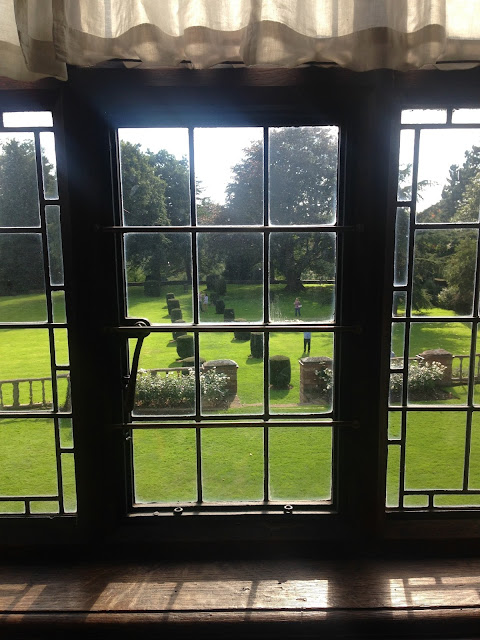
Waking up to this view every morning, would be my definition of perfection. To then have the opportunity to wander the well groomed gardens on a glorious day.


So if you're feeling bored one Sunday Afternoon why not take the trip to this beautiful manor to observe magnificent pieces from the Arts and Crafts movement and then treat yourself to a picnic in the blooming surroundings! It really is worth the visit.